Live Soda
The original better-for-you bubbly.

The Organic Living Soda Inspired by Nostalgic Classics
The Context
Live Soda was born in Texas in 2013 and became an instant cult favorite for those who believed “better-for-you” was a way of life. Acquired in 2024 by Future Beverage Group (Better Booch, Cha), we joined forces to rebrand for what culture expects today.
The Insight
“Organic Living Soda” became the reposition that spoke to the brand’s gut-friendly qualities. But that wasn’t enough. The nostalgic flavor experience was both their superpower and difference. And it had to be immediately felt.
The Big Idea & Success
A flavor lineup that serves up the classics, and a design solution that draws from soda’s heyday instead of better-for-you cliches. The rebrand features a strong unique shape, bold memorable logo, and vibrant tasty color. The result is retro and fun, standing alone in a sea of trendy, poppy counterparts.


Disciplines
- Visual Identity System
- Packaging Design System
- Packaging Production
As seen in
Dieline -- “Live Soda’s Packaging Is Refreshingly Unbothered By The Category’s Trends.”
Awards
Dieline, 3rd Place, Soft Drinks
ADCC Silver, Rebrand
ADCC Silver, Packaging Design
ADCC Bronze, Logo & Symbols
Team
Design Director: Justin Lortie
Design Lead: Sarah Schiesser
Designer: Leo Maubert
Project Manager: Shanel Lessard
Case Study Team: Capucine Labarthe, Leo Maubert, Alon Baum, Marie-Pierre Lachance
Collaborators
Photography: Michael Kazimierczuk
Prop Stylist: Evelyne Morin
Motion: Charles Desmarais
Other projects

Vacation
Vacation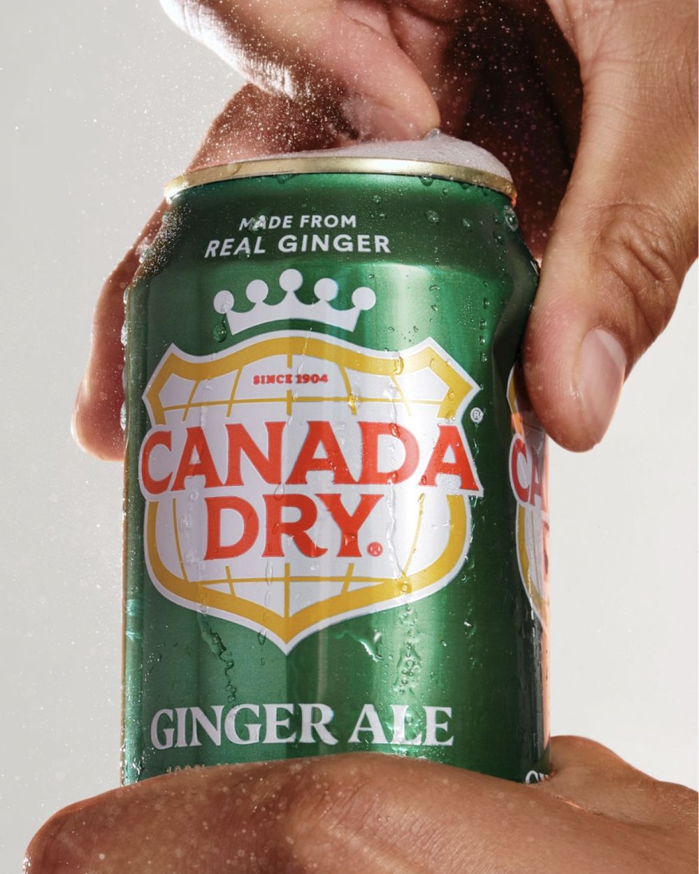
Canada Dry
Canada Dry
Snapple Spiked
Snapple Spiked
Matheson Food Company
Matheson Food Company
Mott's Clamato Caesar
Mott's Clamato Caesar
Cocolab
Cocolab
Cha
Cha