Diana's Seafood
The Mother of Seafood since 1979

Reinventing a seafood company where quality is queen.
The Context
For over 45 years, Diana’s Seafood set the gold standard for top chefs & Michelin-starred Canadian kitchens. They came to us with a new ambition: to create a new CPG brand that raises the bar for the family dinner table across North America.
The Insight
Where most institutions have a founding father, Diana’s has a founding mother. A foundation built on old-world principles, ‘do it right or not at all’ standards, and an abundance of warmth. Design’s role was to tap into this soul and express it from the inside out.
The Big Idea & Success
“The Mother of Seafood”. Diana’s disrupts a stereotypical category of men at sea with a distinct, elevated vibrancy and transparency, reshaping how consumers perceive premium seafood for everyday mealtime. Ultimately, Diana’s Seafood didn’t just enter the consumer space; it emerged as a category-defining force that secured multi-unit national retail partnerships and earned a spot on Target shelves at launch.




Behind The Design
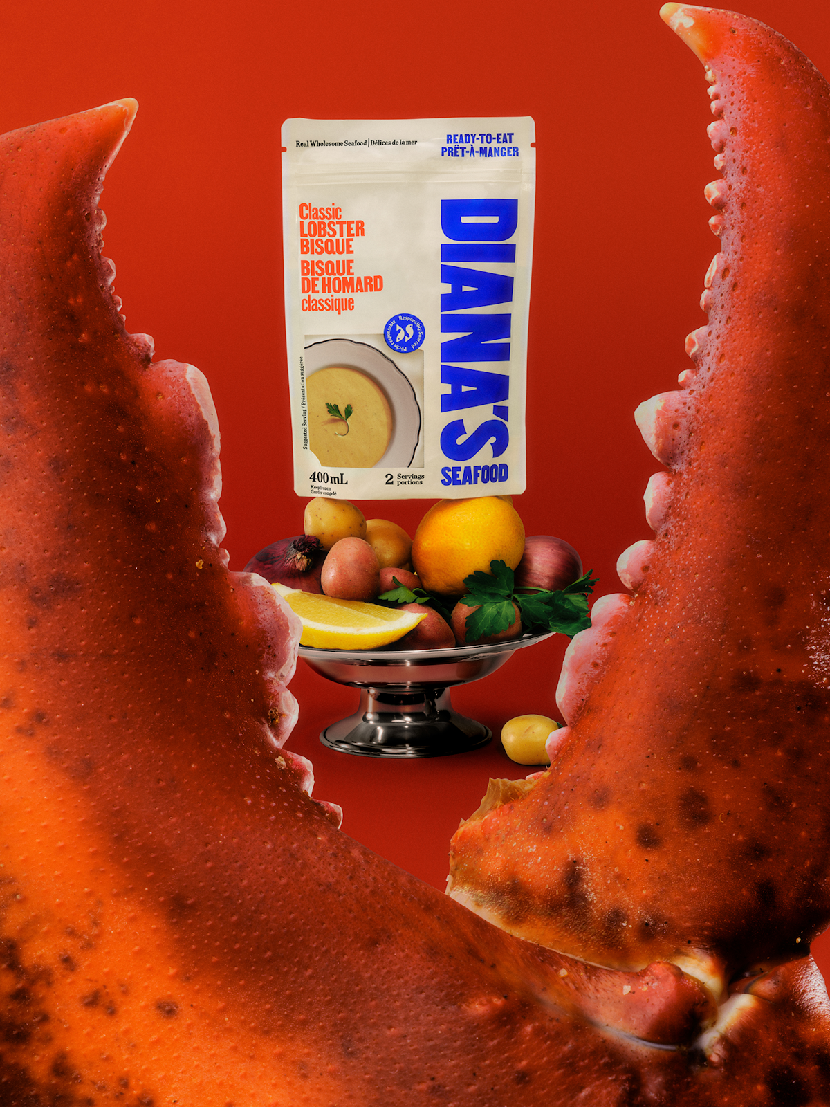
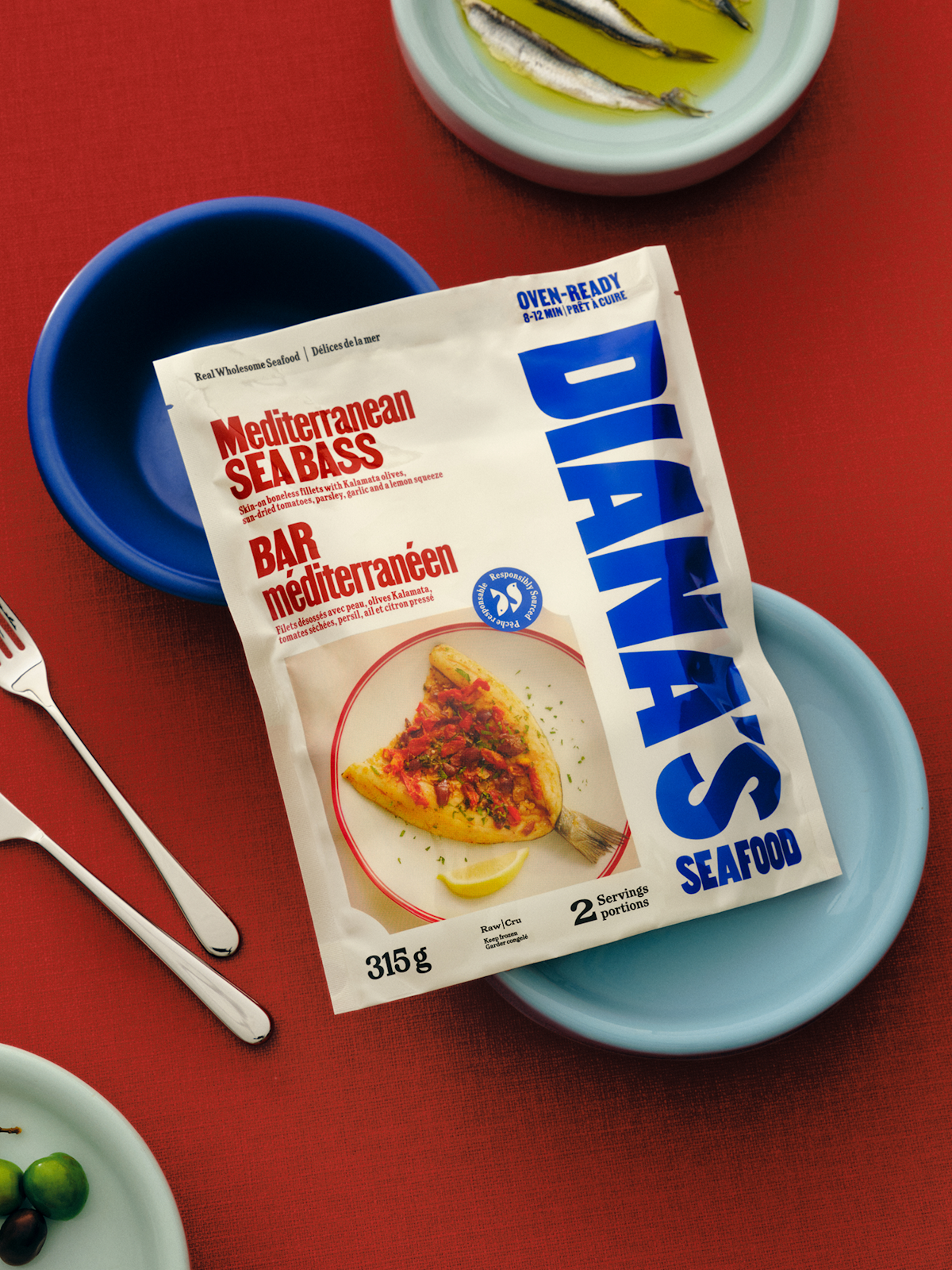
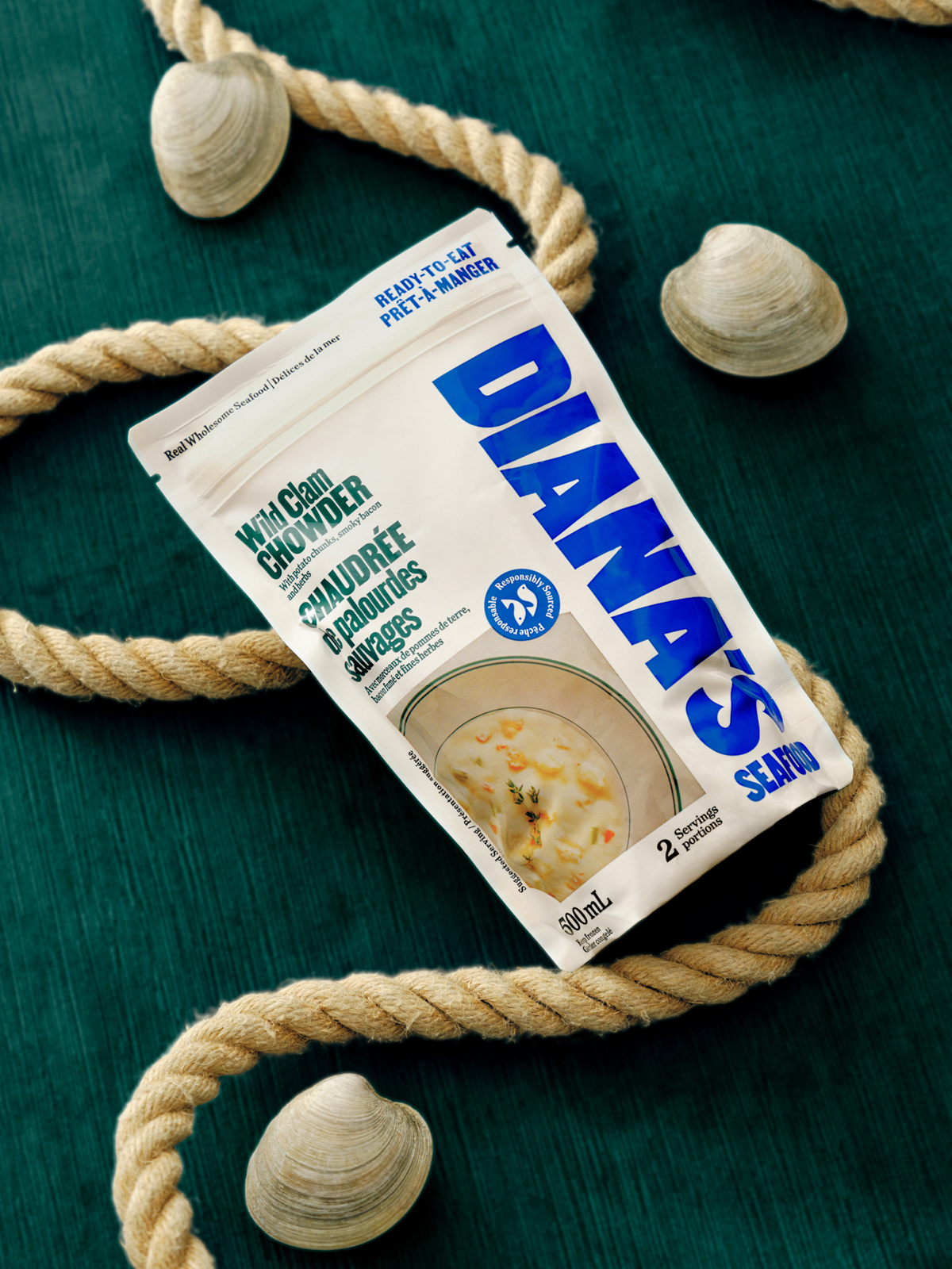
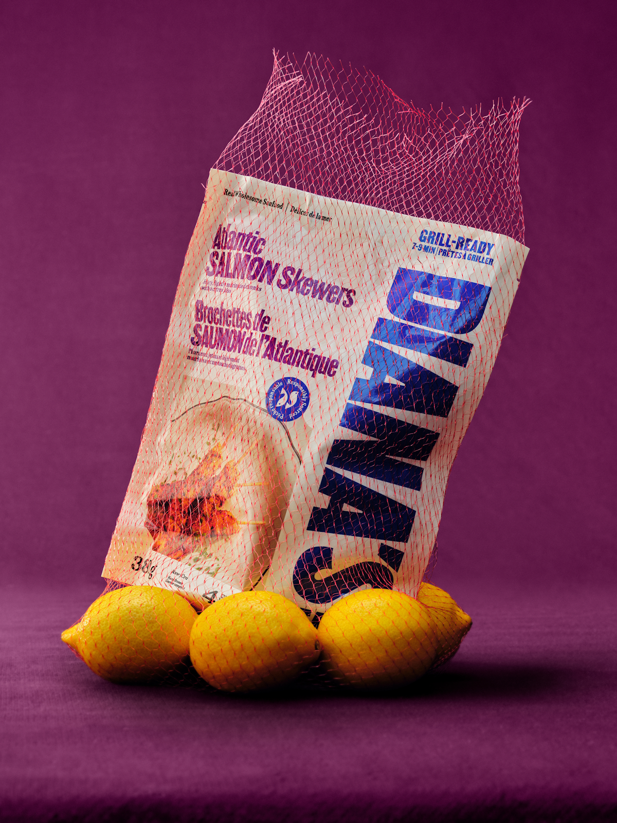
Look at the seafood aisle, and you'll see a sea of blue—different shades all speaking the same language. We leaned into that category code with a fresh, contemporary blue for the wordmark. Like names painted on harbor boats, it is bold, it is utilitarian, it is built to be seen from a distance. To stand strong across the shelf, acting as a visual anchor for the brand.






Behind The Design
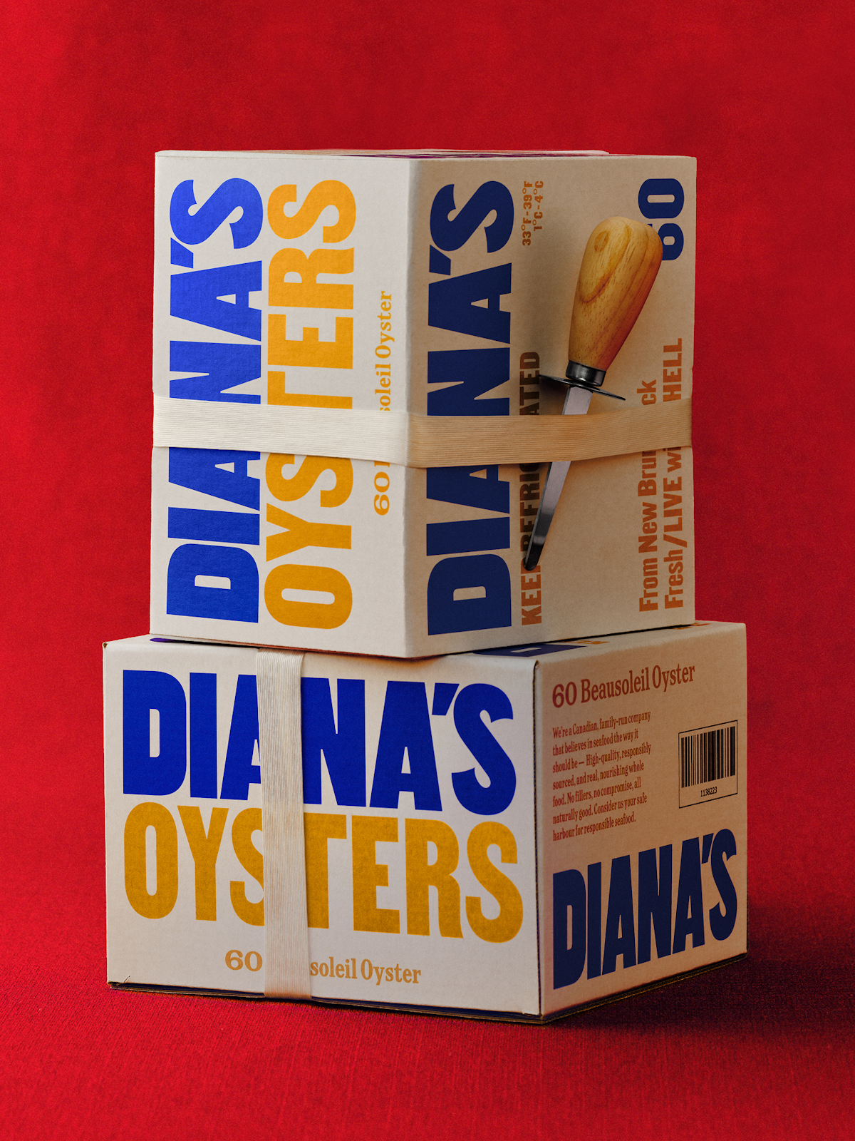
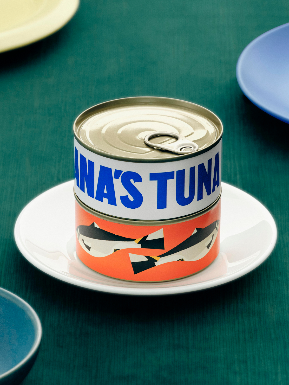
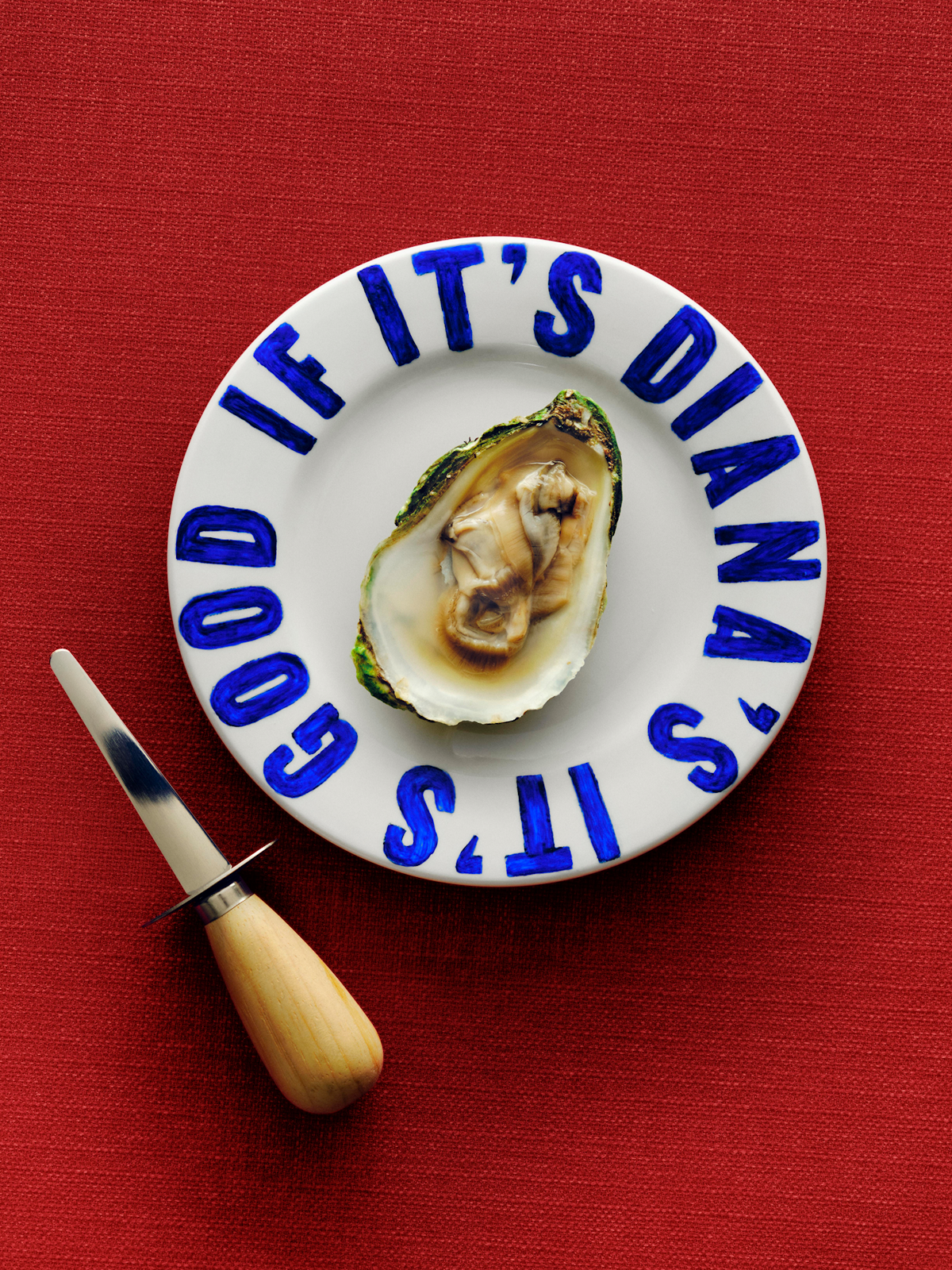
The secondary brand font, Milano designed by Alex Lescieux, is a variable typeface spanning five widths, from Compressed to Extended. During our deep dive into the visual language of fishing culture, we came across old fisherman crates—each marked with hand-painted type that flexed to fit the space. Milano carries that same spirit. It is integrated in the brand with a playful system where mixing widths mirrors the adaptability of those original hand-lettered crates, keeping the brand dynamic and rooted in history.




Disciplines
- Brand Strategy & Narrative
- Brand Voice & Messaging
- Packaging Architecture
- Visual Identity System
- Packaging Design System
- Creative Direction
- Digital Design
- Brand Guidelines
- Packaging Production
- Illustration
As seen in
Creative Boom -- “Wedge reimagines Diana's for a new generation of home cooks.”
The Brand Identity -- “Wedge breathes new life into a Canadian classic with its arresting rebrand for Diana’s Seafood.”
It’s Nice That -- “Wedge’s brand for Diana’s Seafood turns a new tide for the company.”
Awards
Dieline, Best of Brand Identity
ADCC, Gold, Brand Identity
ADCC, Gold, Packaging System
ADC, Merit, Brand Identity
Team
Design Director: Justin Lortie
Creative Director: Sarah Di Domenico
Strategy: Nancy Chen
Design Lead: Guillaume Lavallee
Designer: Elodie Trudel
Art Direction of Photography: Capucine Labarthe, Sarah Schiesser
Senior Copywriter: Zach Radford
SR Production Designer: Etienne Angot
Production Director: Sophie Ouzileau
Project Manager: Shanel Lessard
Collaborators
Illustrator: Bill Rebholz
Photographer (On-Figure & Food): Garrett Naccarato
Prop Stylist (On-Figure & Food): Vanessa Li Jackson
Food Stylist: Daniel Chen
Photographer (Case Study Still Life): Michael Kazimierczuk
Prop Stylist (Case Study Still Life): Evelyne Morin
Other projects

Matheson Food Company
Matheson Food Company
Brami
Brami
Equip
Equip
Paro
Paro
Vacation
Vacation
Canada Dry
Canada Dry
Stone & Skillet
Stone & Skillet