Entre Pierre & Terre
Honest French spirits

Elevating a house of apple-based spirits made with French techniques
The Context
Entre Pierre & Terre is an apple-based spirit house led by master distiller Loïc Chanut. The product is sensationally crafted, but its shelf appeal didn’t tell that story. Wedge was approached to help transform the company and increase desire through design.
The Insight
When a product is 100% artisanal and made with old-world French methods, the design should instantly evoke that quality and craft, with no question.
The Big Idea & Success
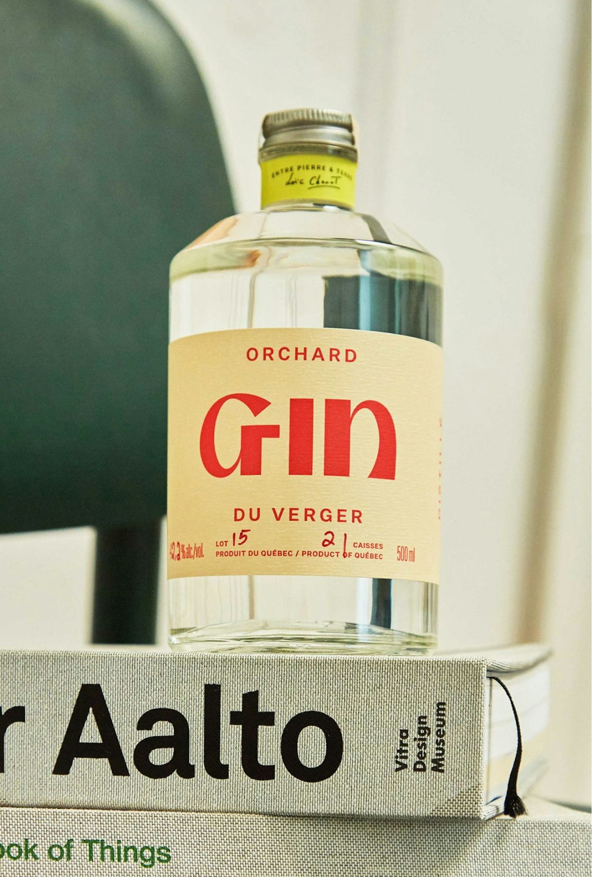
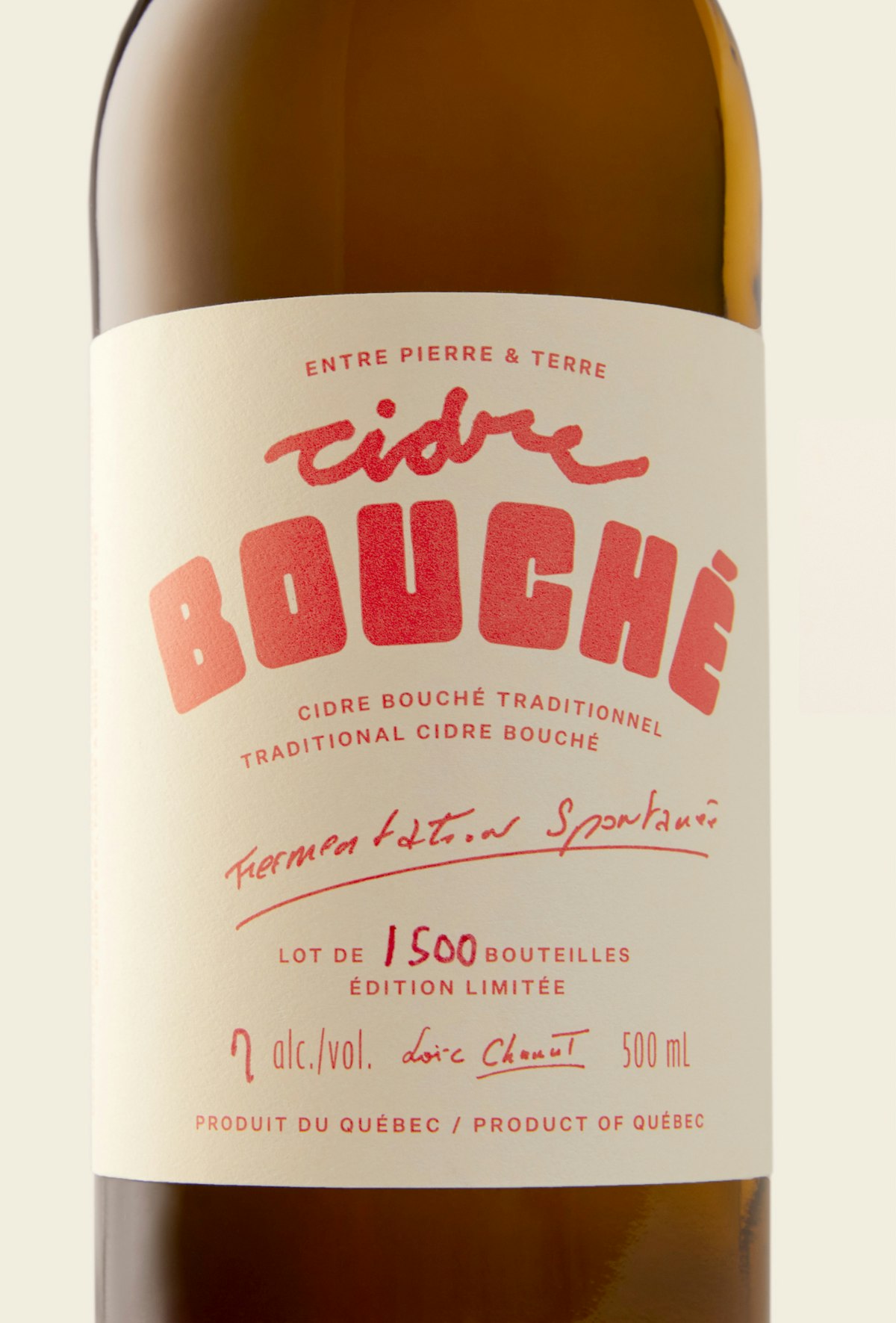
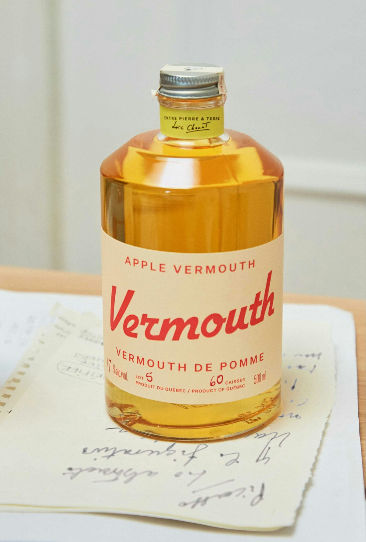
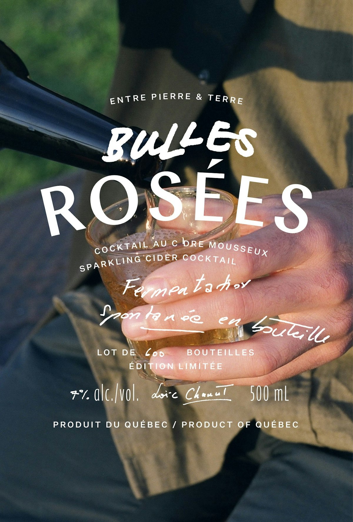
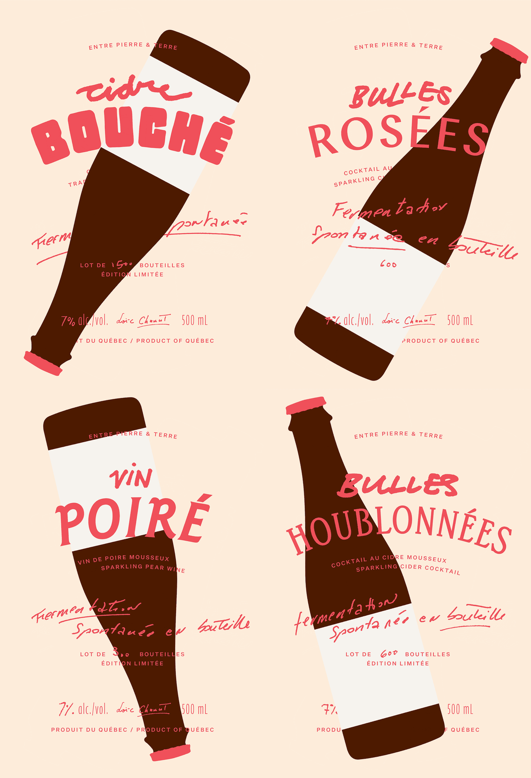
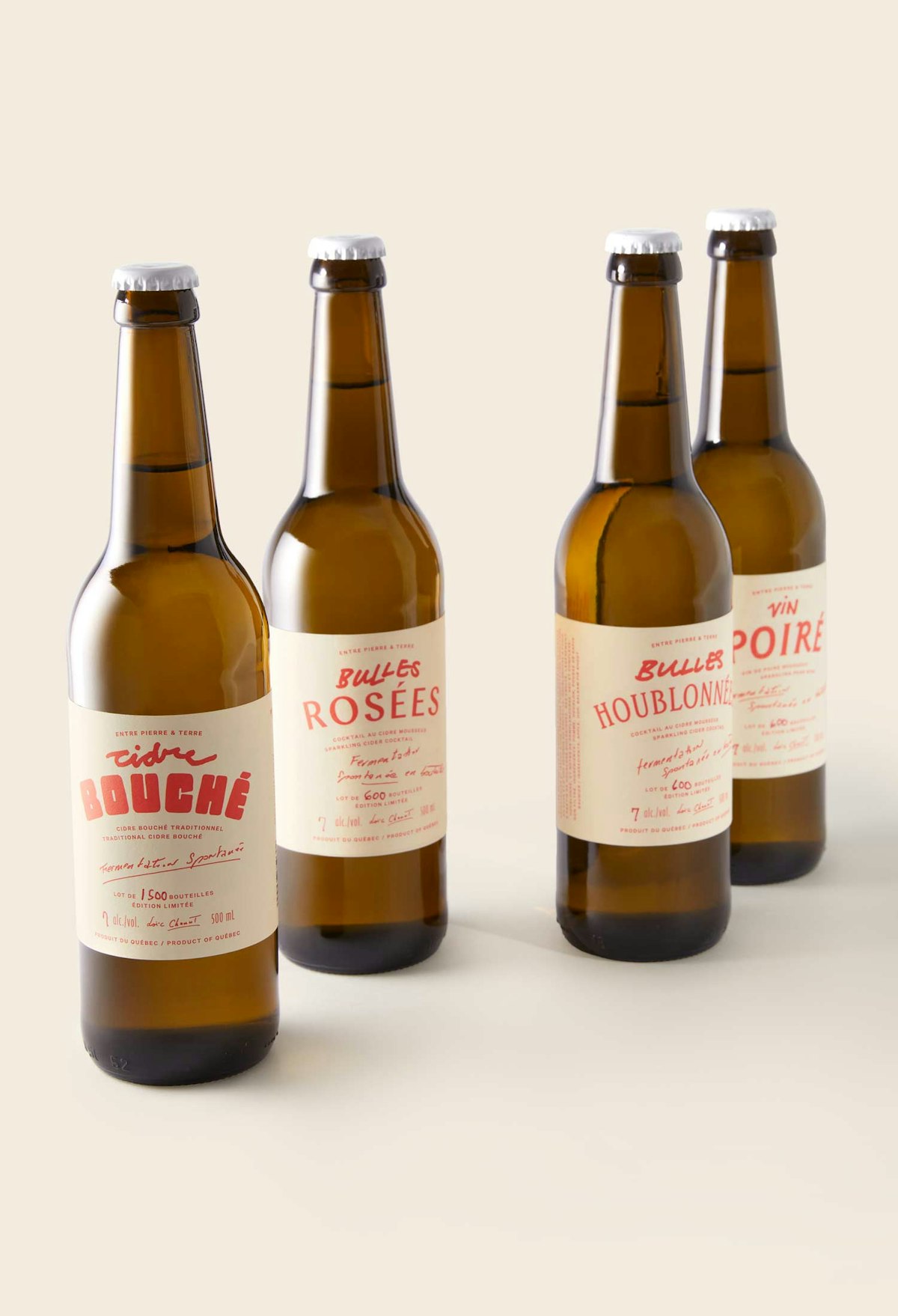
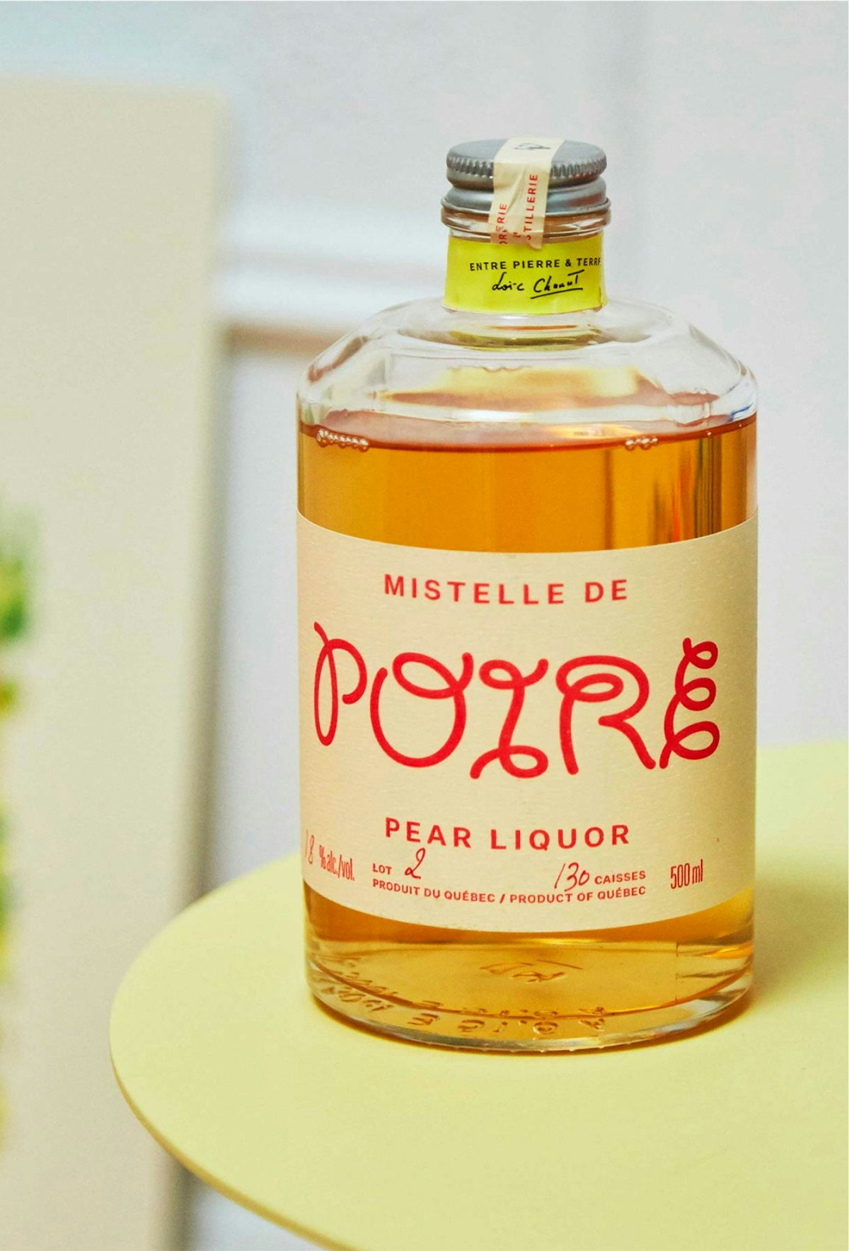
The apple. Red. We asked ourselves: what if we had only one ink and one paper, like the old days? This constraint opened the path to distinction.
Where expressive typography evokes the personality of each drink. Immediately, the design elevated quality perception, enabling Entre Pierre & Terre to raise the price of their spirits, which quickly became a top-selling darling.





Livrables
- Packaging Architecture
- Packaging Design System
- Visual Identity System
- Creative Direction
- Digital Design
- Packaging Production
- Brand Photography
Équipe
Design Director: Justin Lortie
Design Lead: Ariane Leblanc
Designer: Noe St-Onge, Rico Serna
Project Manager: Shanel Lessard
Collaborateurs
Photographer (On Location): Rico Serna
Photographer (In Studio): Nathan Lang
Découvrir plus

Menaud
Menaud
Canada Dry
Canada Dry
Mott's Clamato Caesar
Mott's Clamato Caesar
Bastét
Bastét
Vacation
Vacation
Ami Ami
Ami Ami
Matheson Food Company
Matheson Food Company